Sunday, May 8, 2016
...And More Dalmatian Art
I could never figure out why this scene from 101 Dalmatians shows an out of focus background. Throughout the film all of the line drawing in the BGs are as crisp as the character drawings. But for some reason this close up of Pongo is accompanied by a soft, blurry background.
The previous feature Sleeping Beauty also contains a couple of scenes like this one, when Samson, the horse, is shown in front of an out of focus Eyvind Earle background...strange!
Maybe someone can come up with an explanation.
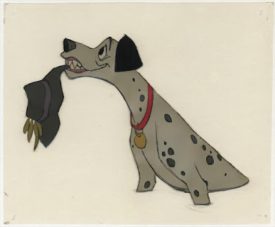
Frank Thomas animated this scene in which Pongo offers Anita's hat, as he feels somewhat guilty for the "wet" situation involving Roger and Anita.
I am not sure if this artwork is actual production, but the xerox line overlay sure doesn't register with the color painting. Beautiful color choices though.
An Art Stevens scene with major drawing help from Milt Kahl, who supervised the character of Roger.
A fun color model cel, featuring several characters in their early stages of visual development.
John Lounsbery second assignment involving buddies, this time around bad ones, Jasper and Horace. Just a few years prior John animated the Italian characters Tony & Joe in Lady and the Tramp.
It's astonishing to see how Marc Davis' rough animation remained intact on the screen. No clean up needed, which makes Cruella even more expressive.
Again, I'm not sure if this is final production artwork, but it is a beautiful depiction of the town of Dinsford, where the film's climax begins.
101 Dalmatians, one of the greatest movies of all time!
Some images Heritage Auctions.
Subscribe to:
Post Comments (Atom)


The architectural backgrounds (interiors and exteriors) throughout the movie are so fantastic.
ReplyDeleteI still have Pongo and Perdita dolls acquired as a souvenir from Disney World years ago.
ReplyDeleteMaybe they were trying to immitate a real close up camera, when the background become out of focus.. but if it was for that reason they could do it in other shots... I don't know!
ReplyDeletePerhaps they did use their multiplane for this shot, or at least put the animation over one pane of glass while the background was a foot or more beneath for the added effect, but it wouldn't surprise me they wanted a typical close-up deal where the character would be in focus for this shot. I guess we'll never know the reason.
DeleteHow would that effect be achieved with the traditional flat art? I assume the Multi Plane could do a rack focus but maybe they were experimenting with other techniques. I've never seen anything that looks like like Bipack in a Walt era film (maybe Fantasia) Its a very novel type of shot for that film.
ReplyDeleteMy guess:
ReplyDelete1) They were experimenting with a shot for future use and figured no one would notice if one quick shot was different or ugly.
2) The camera man's glasses were knocked off and trampled during a polo match, so he focused incorrectly, and reshooting it was not worth the money.
Perhaps when cut into the reel the close-up shot looked too flat for Walt (given that he hated the harshness of the xerox line anyway) and he insisted it be reshot with the BG out of focus to increase the feeling of depth. If it was his call, who could argue?
ReplyDeleteOn the 'Pongo down the stairs to Perdita' set-up, no attempt has been made to register the three elements: character cel, BG overlay cel and colour BG, which had presumably had their pegholes trimmed off earlier. This appears to be some kind of test set-up, or perhaps an illustration of layout for an article - the background xerox is from the drawing used for the production BG, but the colour painting is not the one used in the film (the towel hanging on cupboard door is a different colour, for one thing). In this assemblage the colour BG is not only well out of registration but also rotated at a slight angle - the registration is closest bottom left and furthest top right. My guess is that the original taped set-up had come apart and someone just squared up the sheets as closely as possible, when in the original set-up (with the pegholes registered) the sheets' edges were irregular.
Finally the Dinsford BG is presumably an earlier version - it appears to be a town, from the density of buildings, whereas in the film it is more of a village, with a less-populated street leading to what looks like a war memorial at the top of the hill.
Great to see these artworks - the reference work involved on this film was tremendous, and very accurately (with only a few minor exceptions) reflects the English locations.
When I was little (too long ago) we had the storybook and cassette tape set of 101 Dalmatians, but I just saw the film - and the animation matched to the story - for the first time this week! After all your previous articles and praise for it, I wasn't disappointed. But then it was very unlikely that I would be, anyway...
ReplyDeleteMaybe they reused an area from larger background and looks blurry in result
ReplyDeleteThis is a few years late, but I'm trying to research more information on the line overlay technique. I think the out-of-focus picture above gives an idea of the process. So it was just another Xerox process to add the black lines to the backgrounds? How? There's very little information on this process out there!! Any insight would be appreciated!!
ReplyDelete