Sunday, July 13, 2014

Soccer/Football

Obviously I need to have a post that celebrates the German team winning the World Cup. Yeeaaaahhhh…..
The soccer game in Disney’s Bedknobs and Broomsticks was unbelievably popular in Germany when the film was released there in 1972. It was shown on TV over and over again, and when Disney released the sequence on Super 8 film as home entertainment, it became by far the best selling Disney clip.

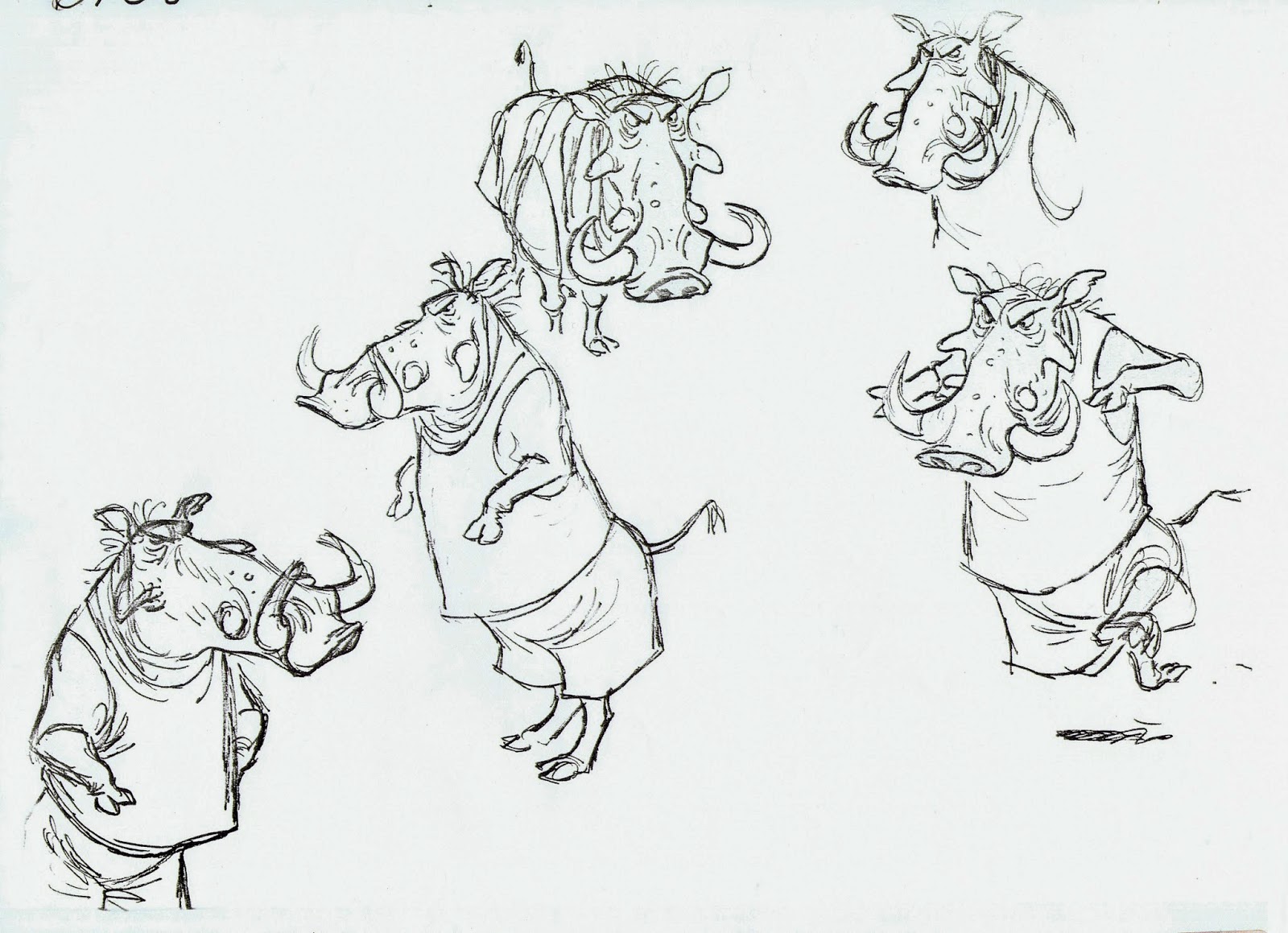
Here are a few of Milt Kahl’s gorgeous designs for a few members of the infamous “Island of Naboombu” soccer match.


An earlier leaner warthog design.


All I remember when I saw the match for the first time on the screen, it gave me one of those Disney “highs”. And Kimball’s direction had a lot to do with it.

Did I mention Germany won…?

Links to previous posts on Bedknobs and Broomsticks:


Friday, July 11, 2014

Wendy and Peter's Shadow


I’ve always loved this section from the film Peter Pan’s opening sequence. 
The backgrounds look very soft and dreamlike, and the character situation is just wonderful. Wendy explains to Peter that he can’t attach his lost shadow using soap, it needs sewing (who knew?). What great cartoon logic!

Peter Pan obviously doesn’t know the proper shadow attachment technique yet.


Kathryn Beaumont acted these scenes out for animator Les Clark. Quite the contraption as a stand in for Peter’s leg.


A nice animation key drawing by Les Clark.


Can you believe this background from the sequence? What amazing lighting. The beauty of these backdrops is that they look a little deserted without the character level, like a gorgeous painting that is missing something. This little masterpiece is on screen for only a few seconds.


A frame from the scene.


The craftsmanship and care that went into making these Disney movies never ceases to amaze me.

Wednesday, July 9, 2014

Bambi and Thumper on Ice


As I mentioned in a recent post, each of Disney’s Nine Old Men had not only high standards, but also strong opinions about when it came to looking at a colleague’s work.
That doesn’t mean that they didn’t work closely together in an effort to get the absolute best result on the screen. Milt Kahl often discussed acting possibilities with Frank Thomas, and Frank got help from Milt when it came to improving a drawing.
While working on Bambi, Frank was looking forward to animating the sequence with Bambi having trouble moving on ice, while Thumper performed like a professional skater. Then word got around that Walt Disney was thinking about cutting this section from the film. To prove the entertainment possibilities in the sequence Frank quickly drew a series of sketches and had them put on to film.  The result convinced Walt that these character rich situations needed to be part of the movie.
Frank's beautiful sketch above is a publicity illustration, based on his exploratory story work. 
Years ago, when I came across the drawings below, I knew right away that Milt had also contributed to the sequence by helping Frank with staging certain poses and situations.
That kind of teamwork is one of the reasons why the studio was able to elevate animation to unimaginable heights.

So far I have not seen any of Frank’s own story sketches for the ice skating sequence yet. But you never know when and where these gems might surface.


Tuesday, July 8, 2014

About Special Effects and Old Men

Do you ever get the feeling that a certain commercial project by somebody was actually made for you? 
There are a couple of items that fall into this category, and I’d like to bring them to your attention. Two significant milestones in documenting Disney Animation history.


John Canemaker just came out with a book that deals with the techniques and behind the scenes of Disney’s Golden Age. The title is “The Lost Notebook-Herman Schultheiss and the Secrets of Walt Disney’s Movie Magic”.
Amazon writes:
“Discover the secrets behind Fantasia, Pinocchio, Dumbo, and Bambi-all through the lens of early animation’s most enigmatic and fascinating character, Herman Schultheis.”
This is a coffee table book full of never before seen photos, artwork and technical charts that take your breath away. You find out about live action reference for “Dance of the Hours”, how the oversized snowflakes at the end of the “Nutcracker” made it to the screen, and so much more. Schultheis’ own life story, which took him from Germany to Burbank and beyond reads like a script for a Hollywood film. All I can say is: Must have!


Here is the Amazon link:


Next up is a terrific documentary by Frank Thomas’ son Ted, called “Growing up with Nine Old Men”.
It is included in the bonus material for the BluRay of Peter Pan (North America), and The Jungle Book (Europe and other terriories). During the 45 minutes film you find out what it was like to grow up having a top Disney animator as your dad. Ted’s previous feature film documentaries include “Frank and Ollie” and “Walt and El Groupo”. This film is very personal, we follow Ted’s journey to meet up with other children of the Nine Old Men, some he knew from childhood, others he had never met.
You’ll find out from Milt Kahl’s daughter Sybil, what her dad’s daily routine was after work. 
Who knew that John Lounsbery raised his kids in the country, and that he liked getting his hands dirty pouring cement and taking care of livestock? And wait to find out what life was like in the Kimball home. You get to know these giants of animation from a private angle. 
The film led me to invite the Nine Old Men’s kids to my last Christmas Party. And wouldn’t you know…most of them showed up. What an evening.
This is Miri Weible, the daughter of Les Clark.


Check out the film’s trailer:

An interview with Ted Thomas about his film:

To purchase the film as a part of the Peter Pan BluRay, go to:

Saturday, July 5, 2014

Anita and Perdita in Regents Park


Ken Anderson came up with this beautiful oversized concept sketch showing the female lead characters from the Disney film 101 Dalmatians. It looks like Ken was trying to do anything to get away from the traditional Disney Animation look. His visual experiments greatly influenced the style of the film, which ushered in a new era for the studio and the industry as a whole. One can only hope that feature animation one day will experience another exciting and bold period, when audiences are being presented something fresh and unexpected.
Disney’s award winning short film Lorenzo from 2004 began to show promising, new horizons and possibilities for the medium, but for the time being it is stashed away in a drawer somewhere.

Thursday, July 3, 2014

Ink and Paint


Disney’s ink and paint artists were in a class by themselves. The control the inkers had over super thin, colored lines, put down on clear acetate sheets, was breathtaking. And they were wearing gloves while doing this, any fingerprint on a cel would show up on the screen. Just like animators, they had weekly quotas, cels had to be traced off the clean up drawings in a timely manner. 
The required accuracy to maintain all subtleties from the drawings on to cels was incredibly demanding. 
Just imagine having to trace Wendy’s face. You are ever so slightly off with her facial features, and the character ends up looking like ET. 
Walt Disney did complain when final scenes of Snow White didn’t show that perfect consistency, her eyes, nose and mouth seem to float a little from time to time. After all, this was the first realistic character ever done at the studio, and reaching a level of perfection took a learning curve.
By the time Disney produced Sleeping Beauty the inking had gotten so tight and flawless, there isn’t one bad cel of Aurora in the film. 
Here are just a few examples of the art of Disney’s Ink & Paint department.

This cel from the 1934 Silly Symphony Funny Little Bunnies shows its age. Some of the paint has come off, but look at the amount of work involved in this one image. There is a ton of line mileage on that easter basket, and an endless assortment of colors. 12 - 24 cels per second, its mind boggling.


Donald’s Cousin Gus from 1939. The ink line is mostly dark grey except for the indication of the darker underbelly. What a beautiful color scheme.


Dark grey for the Dwarfs as well, but black for the eyes and again different colors for the shadowy areas.


Multiple color ink lines on Geppetto and his blanket. And the top of his hair gets a dry brush highlight.
Check out the effect his glasses have on his face, slightly darker colors.


If you really want to find out how all the shading was done on Monstro, the whale, you need to look up John Canemaker’s new fabulous book, “The Lost Notebook-Herman Schultheiss and the Secrets of Walt Disney’s Movie Magic”. 


Milt Kahl recalled an issue the inkers had on Bambi. It seemed impossible to keep the width of the deers’ legs consistent. Each cel had a certain thickness, and if you put down ink lines as you moved your head from side to side, the placement of the lines would vary, and those legs ended up looking a little thicker or thinner from one cel to the other. To avoid this from happening, the inkers actually in-betweened subtle leg motion on cels, without referring to the paper drawings.


Less critical inking was required for cartoony characters like Minnie Mouse, here on a cel from the short The Nifty Nineties, 1941.


Alice’s cat Dinah is painted in warm orange/brown colors. For contrast her turquoise eyes sure pop.
Yellow reflections in her pupils, making the eyes look wet.


The White Rabbit is being late as usual, running around with 24 frames per second. This of course means that the watch with all its details needed to be accurately inked that many times as well.


The Walrus is about to enjoy the Oysters. Some of the inking has come off, nothing a good restorer couldn’t fix. 


A nice cel of John from Peter Pan. Notice how his eyelids show a subtle thickness, something that can get lost in the process of redrawing and tracing. Definitely from a Kahl scene.


Just gorgeous colors on this cel of Tiger Lily. Lots of detail on her dress, that pattern around her shoulders would be very tricky to keep consistant.


What a smart choice to have Lady’s fur break up on her body’s underside and the back of her legs. If the fur would break up everywhere she’d look like an uncombed poodle.
There is that nice thickness again on her eyelids. Adds so much dimension. The center of her neckless has two inked colors, giving it some depth.


Tony is painted in night colors. The dark areas around his eyes are defined by neutral ink lines.


I was once complementing Eric Larson on the effective use of light on Peg’s body. He told me that he had nothing to do with that, an effects assistant was responsible for it. But look at how much more inking that involved.


A cel from an Ollie Johnston scene, featuring Mickey announcing the Mickey Mouse Club. 
In an effort to make the character read best on a TV screen, all exterior ink lines were thicker than the interior ones.


An amazing cel of Maleficent confronting Prince Phillip. Every ink line is rock solid, bringing out the stylized character design. To show the candle’s glow, the faces had to be painted in a lighter color.
I couldn’t ink like this if my life depended on it.


Walt Disney visits the ink and paint department during a TV program, where the topic was color.
The three ladies are probably actresses, but I am not sure. The still camera aimed a little low, revealing a taped cue mark on the floor.


I remember visiting the ink and paint building myself way back. There were plenty of painters working on the films of the early 1980s, but only a few inkers. The Xerox process had replaced most of the inking. Only occasional inking was required for things like lips and eyelashes on human characters.
The Little Mermaid turned out to be the last Disney feature to be painted on cels, after that digital ink and paint took over.
A few years ago Vanity Fair published a great article on Disney’s Ink and Paint artists:

All artwork ©Disney/Heritage Auctions

Tuesday, July 1, 2014

A Better Ending for the Dragon Fight?


In December of 1956 these story sketches were photographed before being printed as photostats.
They show a highly dramatic version of the climactic fight between Prince Phillip and the Dragon for the film Sleeping Beauty. In some ways I find this sequence here more exciting than what ended up in the movie. The strong contrast of black and white brings out powerful silhouettes that add visual thrills to the continuity. Look at how the Dragon pursues the Prince by smashing through giant rock formations.
But what I like best is this very different ending to the fight. Prince Phillip actually delivers the final blow by himself, without the help of three Fairies. 
He falls of the cliff, then lands on the Dragon’s tail. He is lifted up high toward the monstrous head…this seems to be it for him. But hanging upside down he gathers his last bit of strength and throws his sword toward the Dragon’s heart.
I think this makes him a stronger character. He doesn’t need the help of the Fairies’ magic.
And if you wanted to keep the idea of magic, the sword could glow brightly before being thrown, (as perhaps indicated in that one sketch).

Great stagigg and editing, interesting to see what might have been.
I love the “Merry Christmas” note at the end, looks like the board got finished just before the holiday break.
Does anybody know the name of the story artist?

For fun, here are a few live action photostats with actor Ed Kemmer, fighting through thin air and imaginary thorns. The last pic also shows the sequence’ s director Woolie Reitherman on the set. 


Here is a link to another post on Prince Phillip, in case you missed it:

Sunday, June 29, 2014

Contract Negotiations


Director John Musker came up with this hilarious cartoon panel featuring Jeffrey Katzenberg and myself.
After I had completed my work on Roger Rabbit I returned from London back to the Burbank Studio.
At that time management decided to put key animation personal under contract. But I was seriously considering to return to Europe to work in animation over there. 
To my bewilderment and surprise I started receiving gifts from Jeffrey’s office, usually with a note that asked me to stay on and sign a contract. The truth is that I did take my time to decide my future, but before I finally opted for continuing work at Disney I was not offered Milt Kahl scenes from the archives.
Instead I had asked for Milt’s animation desk. The deal was that I could have it, IF I could find it around the studio. Well, with the help of old studio photographs I did locate the desk (at least the upper half). The photos showed Milt working on that desk during the 1950s and 1960s. 

It really hasn’t helped me to become a better animator…but it is a very cool thing to own.

Friday, June 27, 2014

Ward visits Fred


In this rare photo of Ward Kimball and Fred Moore, taken sometime in 1941, Ward is showing Fred some kind of gag drawing. It looks like Moore is working on Mickey and the Beanstalk, which later became part of the film Fun and Fancy Free. According to the model sheets the project at that time didn’t have a title yet, it was simply called “Mickey Feature”.
In the end the film’s running time was only 29 minutes. After many story treatments the crew just wasn’t able to stretch the material into a full length feature. Fun and Fancy Free, which didn’t get released until 1947, also included a featurette called Bongo.
(The photo was shown during a brief program about Disney history on CBS.)

Here are the two model sheets from Fred’s desk.


Tuesday, June 24, 2014

Milt Kahl's Tigers

If there is one animal that presents a true challenge to an animator, it would have to be a tiger. Moving a large cat around is difficult enough, wether the design is cartoony or realistic. But to have to keep track of all those stripes adds another level of complexity to the assignment. 
The good thing is that when placed correctly over the animal’s body, the stripes can help define perspective and volume to the anatomy. But for twenty-four frames per second they need to accurately follow the tiger’s outer surface. And that requires a great effort from not only the animator, but also from the assistant, who needs to deal with a hodgepodge of lines when looking at two key drawings on top of each other on the animation desk.
Over the years Milt Kahl had the opportunity to develop three distinctively different tiger personalities.
The first one appeared with Goofy in the 1945 short Tiger trouble. Story artist Bill Peet created this model sheet showing the eccentric character in a variety of expressive poses. (I don’t know why an off model chubby tiger was added to the sheet, on top of the tree. Maybe a colleague told Peet, he is drawing the tiger too skinny).
Milt saw that Peet’s design was ready to go for animation, not requiring any changes at all.
When interviewed about this character years later, Milt recalled that the story called for a screwy tiger who gave Goofy a hard time…nothing special, just baggy pants comedy.


I love Peet’s elephant sketches just as much.
The model sheet below was made up of some of Milt’s poses and served as reference for the 1950 Donald Duck short Lion Around.


Over twenty years after Tiger Trouble Milt animated the villain in the 1967 film The Jungle Book, a very different assignment. Cool, smooth and subtle animation defined this groundbreaking character, who’s role in the film was relatively short, but utterly impressive as a design and performance. Shere Khan was one of the last characters Walt approved for an animated film.


Tigger first showed up in the 1968 featurette Winnie the Pooh and the Blustery Day. He represents a mixture of real tiger, stuffed toy and a Picasso-esque drawing style. His high energy contrasts the other low key personalities beautifully. When I look at these drawings I realize that Tigger was created to entertain kids, but at the same time his design and motion reach the animation stratosphere. 


Here is a clip reel with all three tigers. Entirely different from each other, they all show Milt’s mastery of the medium of animation.


As far as Mushka, the tiger I am currently working on, after a lot of research into real tiger behavior and anatomy I feel ready for production animation. Story work is coming to an end, I am pretty psyched. 

Friday, June 20, 2014

How They felt about each other's Work

Back from France, where I had a blast visiting friends. Didn’t go to Annecy, just hanging out around Paris, which to me is the most beautiful city in the world.
I will be without tech help for a few more days, so here is another post without images.

Since I knew seven of the Nine Old Men (Les Clark and Lounsbery had already passed away when I started at Disney) it was always interesting -though sometimes a little awkward- to hear their comments and opinions about the other ones’ work.
Frank and Ollie often brought up the subject of Milt Kahl’s superb draughtsmanship, but they both felt that Milt had shortcomings as an animator because drawing and design were Milt’s main concern. Not the inner feelings of the character. Frank thought there was a time (during the late 1930s through the 1940s) when Milt was just perfect for the studio. His designs and animation took the Freddy Moore approach to a more refined level, and other animators were able to follow his lead, graphically.
Later Frank also said this about Milt’s animation: “Milt is right about 90 percent of the time, but when he is wrong…boy, is he ever wrong!”
To me, this is actually a huge compliment from one master animator to another. The following statement by Frank is not. “Milt Kahl is an animator who used animation principles very intelligently.”
That’s basically saying, Milt was more of a technician than an artist.
Ollie stated one time that Milt only did what was required in the story boards.

Frank and Ollie thought that Lounsbery had the chops to be a great animator, but that he didn’t work hard enough.

As far as Marc Davis, they thought that he used live action reference too literally. They placed Marc between their own approach to animation and that of Milt Kahl. Milt being too absorbed by perfection in drawing, and their animation being driven by the characters’ inner emotions.

Frank stated that in his opinion Ward Kimball’s only sincere character was Jiminy Cricket. After that Ward started experimenting for experimentation’s sake.

Frank and Ollie liked Woolie Reitherman’s action sequences, but they occasionally questioned his judgement as a director. Robin Hood was the film Frank enjoyed the least working on.

As you can imagine, Milt had strong opinions as well, when it came to looking at his colleague’s work.
He thought that Frank and Ollie could do about anything in animation, but their work was handicapped because of poor drawing. On his last film The Rescuers Milt got so upset with the lack of quality in Frank and Ollie’s work (as well as the work of other animators) he literally blew a fuse. He felt that Bernard and Bianca moved like humans and not like mice.

About his friend Marc Davis, Milt said that Marc was the better draughtsman, but he was the better animator. “When Marc designs a character he starts out by making great drawings right from the start, while I struggle with a lot of bad sketches before I arrive at something I like.”

Milt on Lounsbery:” You had to give him the broad characters, he would do well on those. But he was limited, because he couldn’t handle characters like Peter Pan or Wendy.”
Milt judged Ward Kimball in a similar way, but admitted that Ward would often come up with character situations he himself could never do, like Lucifer the cat looking for a mouse under the tea cups.
Milt thought that was just brilliant.

Milt wasn’t overly enthusiastic about Eric Larson’s animation, but felt that the best thing in Lady and the Tramp was the character of Peg.

Marc Davis’ favorite animator was Milt Kahl. “You never know how Milt is going to animate a scene, he always surprises you.” Among Marc’s favorite Kahl characters were the dancing Llama in Lake Titicaca, and Tigger. 
He talked about animator casting for Peter Pan, and felt that Milt should have gotten Captain Hook  to animate. “In the film Frank’s acting is ok, but the drawing is subpar.”

Eric Larson was complimentary about all of his colleagues. When talking about Milt Kahl he mentioned: "We all learned from Milt, but I did disagree with him on more than one occasion.”

I am not sure how Kimball felt about the others’ work. He was generally concerned about too much realism coming into the Disney features. One time he gave Milt Kahl, who often handled realistic characters, a “compliment” : “Boy, you are so good with that boring stuff!”
Sometime in the late 1970s the studio screened the film Dumbo for newcomers in the training program. One of the trainees ran into Kimball afterwards and said: ” Ward, Frank Thomas just mentioned that he thinks there isn’t one scene in Dumbo that doesn’t need improvement.” Ward’s answer was:” Frank said that because he didn’t work on the picture.”

According to someone who knew John Lounsbery, during what must have been a down day for him, John stated:” Let’s face it, there is Milt Kahl and the rest of us are just a bunch of amateurs.”
We all know that nothing could be further from the truth.
These guys were ALL phenomenal artists, and with that comes the occasional insecurity, professional jealousy and even a little bit of arrogance. But go and try to name another group of artists who not only changed the medium of film, but changed the lives of so many people.